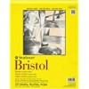
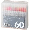
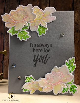
Hello there! Today I have a fun card that started out as an experiment. I’ve been practicing using my Zig markers and wanted to do something very pastel and springy. I stamped the flowers and greenery from Altenew Peony Scrolls onto some Bristol White Smooth cardstock with Versamark Ink and then heat embossed with white embossing powder, which is something I rarely, if ever, do. I only used 4 Zig Clean Color Real Brush Markers for this card.
I wish the pictures could really capture the beauty of this card. It’s another gloomy day in California. On my Instagram account, I did put up a picture of the flowers only when I first colored them for The Daily Marker 30 Day Challenge in March.

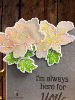
As you can see with my coloring, the top two roses are Light Pink only, which is what I used for my base on all of the flowers. For the roses towards the bottom, I colored in Lemon Yellow to make my highlights and this beautiful shade of peach. That was a very nice happy accident. They turned out lovely. For my greenery, Light Green was my base color and I accented the leaves with Yellow Green. Everything blended together beautifully and that’s such a bonus with markers. These markers can be used with or without water.
I arranged my roses and leaves in a very unique way taking them off of the edge of the card without cutting the excess off. I just wanted to do something different and am going to continue to try to spread my wings a bit. As you can see in the photo above, I was surprised that the Bristol Smooth White started to pill on me. I took my time coloring these images over the course of a few days and didn’t crazy layer on color. Maybe I didn’t use enough water. I don’t know. But again, this caught me off guard since I’ve heard so many people say that Bristol is the best for Zigs. I think I’m going to try Canson Watercolor next time. I do not recommend the Ranger Tim Holtz Watercolor Paper. The color just does not move on that cardstock and turns into a hot mess. Despite the light colors, I love how vivid they turned out in real life.
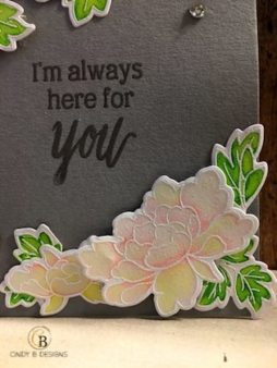
I love the bottom right of the card. It really balances everything out and with my card base color choice of MFT Stamps Cement Gray, my flowers and leaves really jump out at you! With the Zig markers, watercoloring is also super easy for beginners if you heat emboss. This will cause a resist of the watercolor and the slight raised edge of the heat embossing on your images provides a well of sorts for your paint or markers to stay within the confines of the image that you are coloring. When your watercoloring is dry, take a tissue or paper towel and wipe off the white heat embossing to shine it up a bit after coloring.
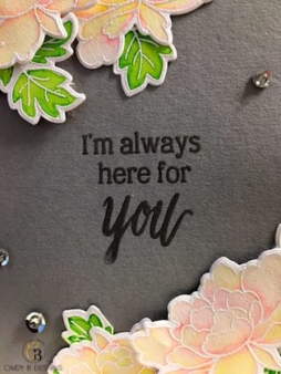
Now for my sentiment. I used Altenew Painted Rose for this and did a little stamp surgery. It’s okay to cut apart your photopolymer stamps to get more mileage out of them. They won’t holler at you and you’re not killing them. You simply line them back up if you want to use them the way the manufacturer printed them. I have such fine details on my card that I grabbed for what I thought was my white ultra fine detail embossing powder. I can’t believe the container didn’t list the color of embossing powder. I saw the “ultra fine detail” and it looked white on the outside so I grabbed it. I stamped the sentiment in Versamark Ink after treating the card base with my anti-static powder bag. I then sprinkled over the embossing powder and was wondering why I’m not seeing a distinct white. I didn’t think too much of it until I started to heat emboss and saw that it melted clear and gasp! I thought the white heat embossed sentiment would really tie in nicely with the white heat embossed flowers and leaves. I then did an experiment of grabbing a scrap piece of cardstock and heat embossed with white powder and put it over the sentiment on the card. I’m glad I grabbed the wrong embossing powder. The white sentiment was so bright that it literally drowned out my images, so this was another happy accident with this card.
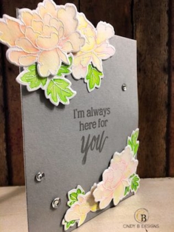
If I could change anything about this card, it would be to have the top cascade more so like the bottom of the card for a more balanced and cohesive presentation, and I would also move the bottom flowers closer to the edge of the card base and angle them differently.
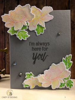
To finish my card, I added 3 silver sequins in various sizes and put a rhinestone in the middle of the silver sequins. This card is on the clean side with my images grouped.
Experiment and see what new colors you can come up with. I’d love to see what you make! If you’d like, you can upload your works of art to my severely neglected Facebook Page or leave a comment with a direct link to your project.
Thank you so much for stopping by to visit me today. Have a great day and God bless.