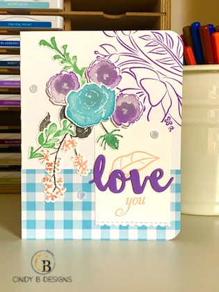
Hello there! I’m going back to the Holiday 2018 Catalog with First Frost, which has carried over to spring. I love the versatile DistINKtive images in this set and coordinating die-cuts.
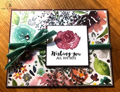
By simply changing up and out colors, you can alter the parameters of design from season to season. Here is a clean and simple card I made in August 2018 with the same set in more of a regal color palette.
 Today’s card is very upbeat with Balmy Blue, Highland Heather, Mint Macaron, Petal Pink, and Smoky Slate. I accented most of the images with Smoky Slate via a sponge dauber for the center of the flowers and using the Stampin’ Write marker applied directly to the foliage to define the branches rather than all one color. I think it makes a tremendous difference in presentation.
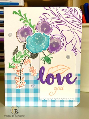
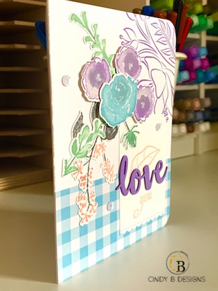
Here, we have some great definition of images and dimension that’s really eye-catching with a stacked die sentiment. I altered one sentiment from Humming Along by performing a little “surgery” on it as I wanted the scripty “you” that had the appropriate size for my die-cut. You have to make it all work with what you have. This is why I’m a big believer in shopping your stash and using it all up. Experimenting outside of the box is a good thing.
Don’t forget about the giveaways I have going on HERE and HERE.
I hope that you enjoyed today’s project. Thank you so much for stopping by to visit. Have a great day and God bless.


Purchase your Stampin’ Up! products from my Stampin’ Up! Online Boutique from the comfort of your own home with direct delivery to your doorstep!


 Designer Series Paper")


