Hello there y’all!
Believe it or not, there’s an awful lot going on this project that really should have an accompanying video. I want to reconstruct this anyway to fine tune and will start filming.
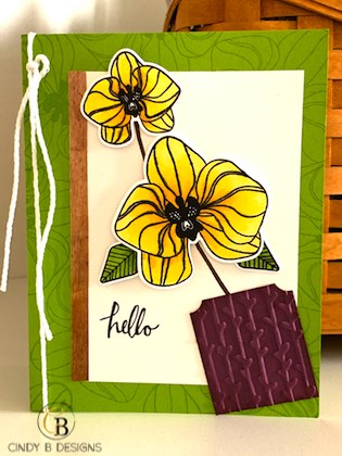
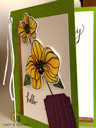
- One way to add subtle design to anything is tone-on-tone color. My card base is Granny Apple Green and I used the 2 large focal images from Climbing Orchid to repeat stamp onto the background with Versamark. You can also use the coordinating ink color, but I wanted more subtle to enhance the open space a bit.
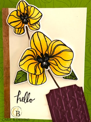
- I wanted to feature modifying punches to create various elements and accessories, but I’m not too thrilled about how my alleged “flower pot” turned out from the Everyday Label punch. I cut off the bottom, added Fresh Fig ink to the sides for depth, and dry embossed with Petal Pair for texture. I’m definitely on the fence, hence a second try this weekend.
- The orchids are colored with Stampin’ Blends in Daffodil Delight. I like my images and sentiments to be crisp. If you look at the images on this project, they are very healthy, even after alcohol markers. I figured out how to achieve this look. I became Copic Certified about a decade ago and I’ve really been able to apply that knowledge to using the Blends and stretching out the light and dark for the everything in-between.
- Wood Textures Designer Series Paper is on the left side of the image panel with Thick Whisper White Baker’s Twine.
Thank you so much for stopping by to visit me today. God bless and have a great day.


Purchase your Stampin’ Up! products from my Stampin’ Up! Online Boutique from the comfort of your own home with direct delivery to your doorstep!

**

**
Love the tone on tone background and those gorgeous flowers! Beautiful card!